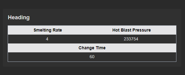
This widget is designed with versatility in mind, offering two distinct formats for presenting information.
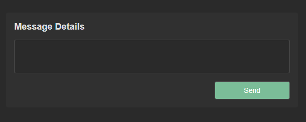
This widget incorporates a versatile text input field, providing users with the option to either manually enter text or load existing data into it.
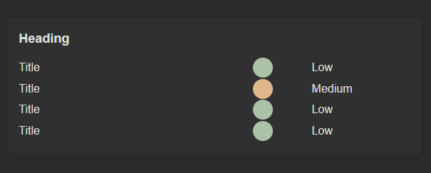
This widget is structured with three distinct columns, each serving a specific purpose: the title column, the indicator column, and the data status column.
This widget serves as a versatile layout option, designed for seamless integration with other widgets and elements within your interface.

This widget offers two distinct states: Running and Not Running, serving as valuable indicators for the data or functionality integrated within the widget.
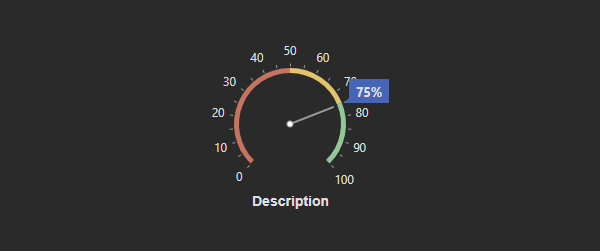
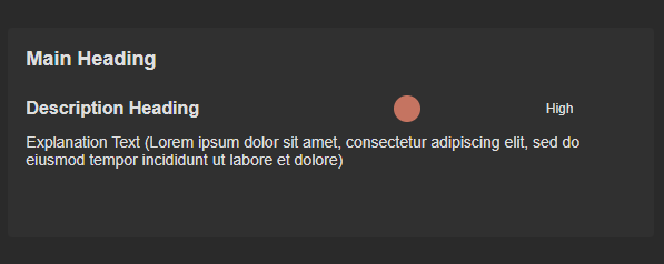
This widget comprises two primary components: the description and the circular gauge. The description provides textual information or context, typically explaining the data or the purpose of the gauge.
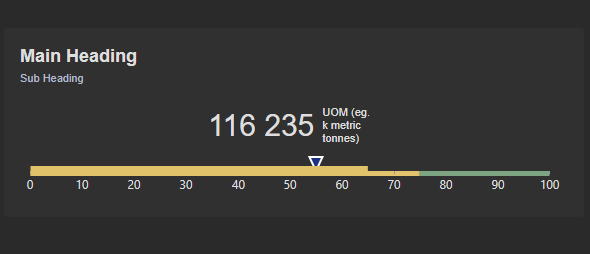
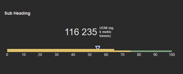
Within this widget, you'll find both a heading and a subheading, complemented by a linear gauge and a value field.
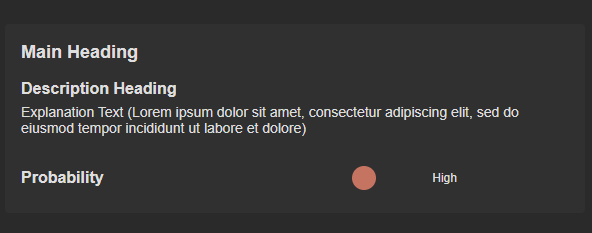
This widget includes a main title, a subheading, an indicator, and more detailed content below.
This widget includes a main title, a subheading, an indicator, and more detailed content below.
This widget includes a main title, a subheading, an indicator, and more detailed content below.
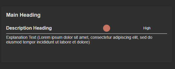
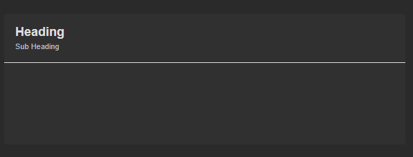
This widget incorporates a unique design feature — an elegant vertical line positioned beneath the primary heading.

This widget serves as a fundamental card outline, ideal for highlighting and presenting important information or adding an aesthetic touch to your content.
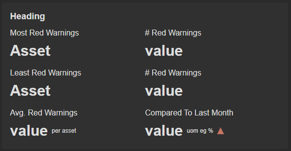
This widget is comprises of six (6) title-value components along with a heading. These title-value components serve as informative building blocks, offering quick access to key metrics.
This widget includes a heading and a subheading where you can enter the title and an additional description to provide further context for the title.
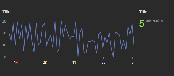
This widget is structured with a title and a graphical chart positioned on the left side, while on the right side, there is another title paired with a corresponding numerical value.
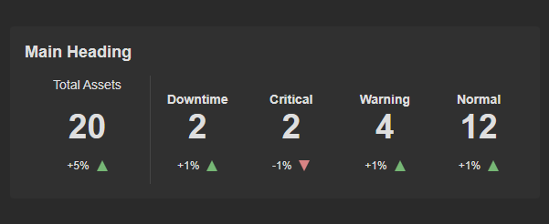
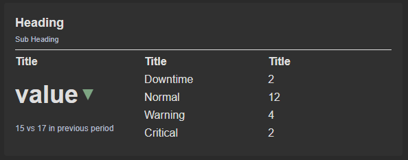
This widget is broken down into two sections, the left Total Assets is the total area and the right section past the vertical line is where you can get specific.