App Designer Widget
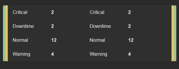
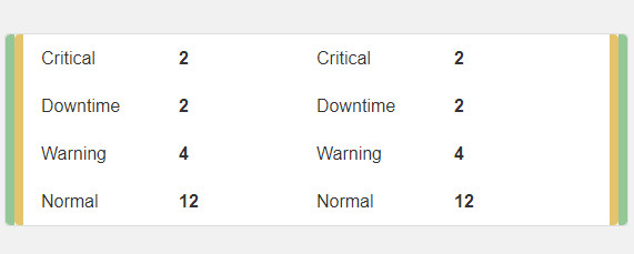
This widget consists of two columns featuring dynamic value pairs, it also includes two columns with borders that can be selected or configured according to your preferences (Note: adjust their visibility per your own requirements).
The value pairs within this widget automatically adapt and adjust their content based on the data they are associated with.
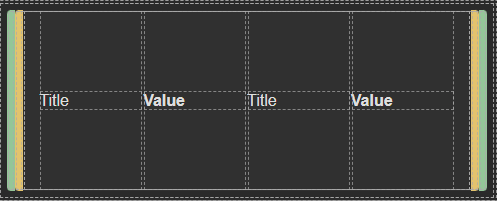
The widget is configured using:
| Block | Description |
|---|---|
| Text | To display the live data |
| Box | A Box is a simple block that allows you to add data or other elements inside it |
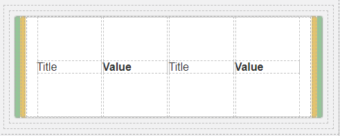
To set up and utilize the Data Source, begin by selecting the box labeled Data Source (as displayed in the image). Next, navigate to the Block Properties and specify the data you wish to display.
Ensure that you update the content of each text element to retrieve their values from the designated data source. The dimensions of the widget will seamlessly accommodate the size of the dataset you select, dynamically adjusting to match the count of the data source you have chosen.
In other words, whether your dataset is large or small, the widget will adapt in size to accommodate and display the data effectively.
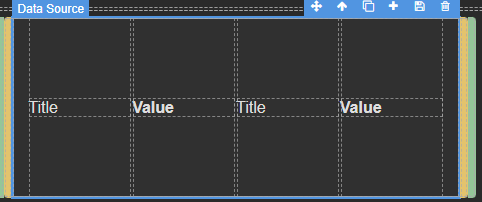
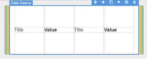
Make sure to change the fields within the box to get their values from the data source vs static.