App Designer Widget
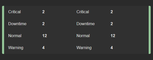
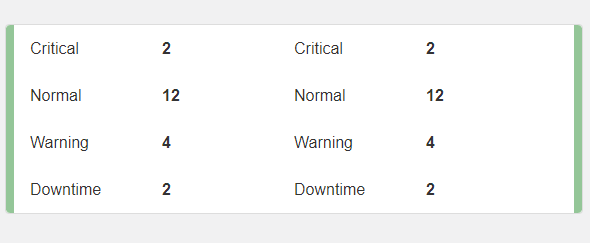
This widget boasts a single border design, providing an efficient two-column layout for your value-pair content.
Its dynamic nature means that it seamlessly adapts to the data source you integrate with it, effortlessly generating the necessary content as you provide data. This flexibility ensures that your widget remains up-to-date and responsive to changes in your data source, making it a powerful tool for presenting and organizing information.
The widget is configured using:
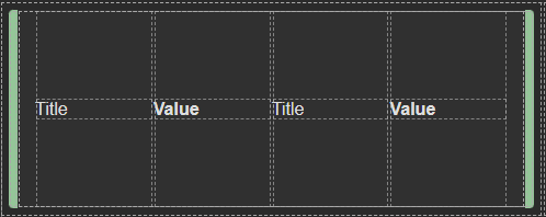
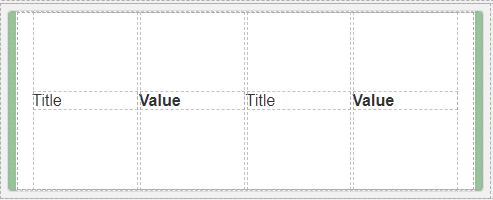
| Block | Description |
|---|---|
| Text | To display the live data |
| Box | A Box is a simple block that allows you to add data or other elements inside it |
To configure this widget select the Data Source, from there, you have the flexibility to choose your desired data source under the Block Properties and ensure that each field within the data source box is appropriately mapped to acquire its corresponding values.
This configuration ensures that the elements within the widget are automatically generated, dynamically adjusting in response to the dataset’s size and content. As your dataset expands or contracts, the widget intelligently adapts by automatically resizing and adjusting its height, ensuring a seamless presentation of your data.
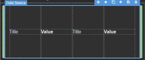
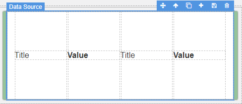
Make sure to change the fields within the box to get their values from the data source vs static.