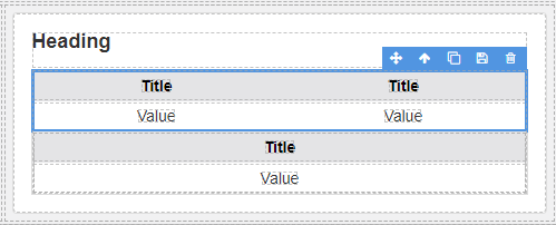
App Designer Widget
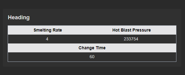
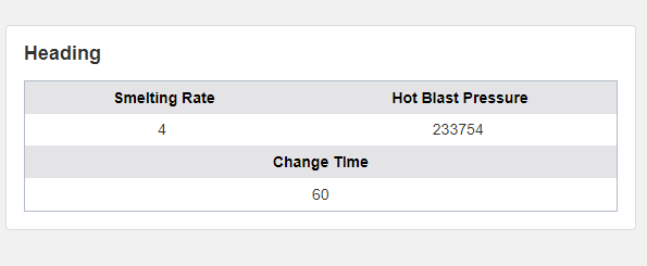
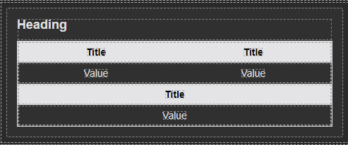
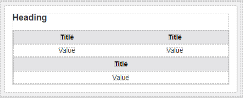
This widget is designed with versatility in mind, offering two distinct formats for presenting information. It includes both a two-column title-value pair on the top row layout and a single-column title-value pair in the bottom arrangement.
Notably, the rows within this widget feature an alternating color scheme, which can be tailored to your specific preferences and requirements. And to enhance the visual appeal and content emphasis, a prominent heading is also included.
The widget is configured using:
| Block | Description |
|---|---|
| Indicator | To visually indicate the active state of the assets |
| Text | To display the live data |
| Box | A Box is a simple block that allows you to add data or other elements inside it |
To configure and use the total section, select the box named Data Source and configure its data source under Block Properties.
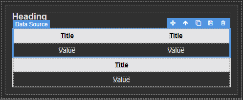
Make sure to change the fields within the box to get their values from the data source vs static.