App Designer Widget
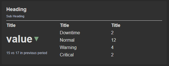
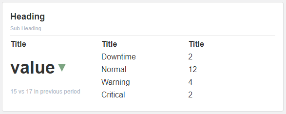
This widget includes a heading and a subheading where you can enter the title and an additional description to provide further context for the title.
The Up and Down arrows are indicators and can be adjusted to dynamically show up and down or convert them into another shape in the block properties.
The widget is configured using:
| Block | Description |
|---|---|
| Indicator | To visually indicate the active state of the assets |
| Text | To display the live data |
| Box | A Box is a simple block that allows you to add data or other elements inside it |
To configure and use the data source section, select the box named Data Source and configure its data source under Block Properties.
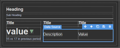
Make sure to change the fields within the box to get their values from the data source vs static.
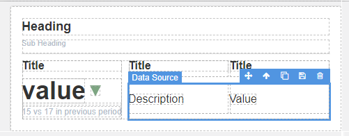
To configure and use the Total Data Source section, select the box named Total Data Source and configure its data source under Block Properties.
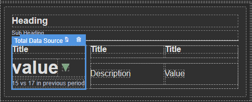
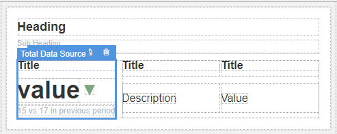
Make sure to change the fields within the box to get their values from the data source vs static.
The way this functions is that for each row retrieved from the data source, it will generate an equivalent number of data entries in your data source box, if you have 4 rows it will generate 4, if you have 3 rows it will generate 3. This implies that the data will populate automatically, and the box will dynamically adapt its size according to the amount of data in your data source.