
App Designer Widget
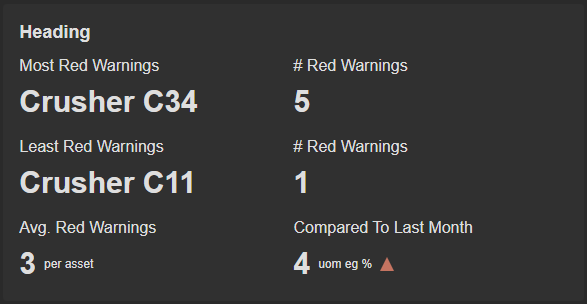
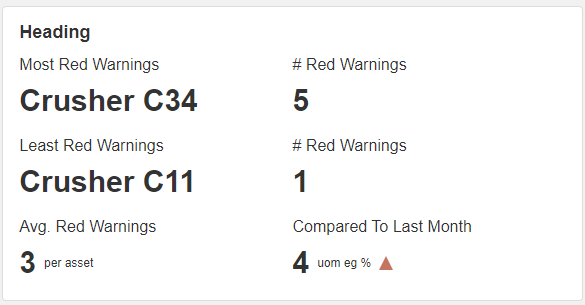
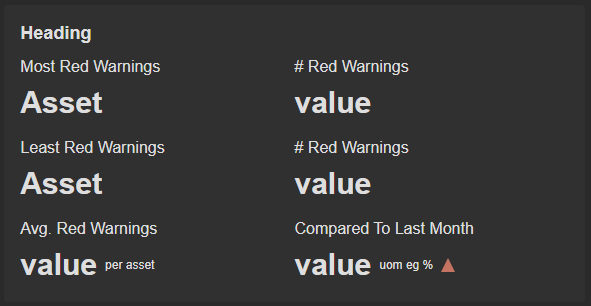
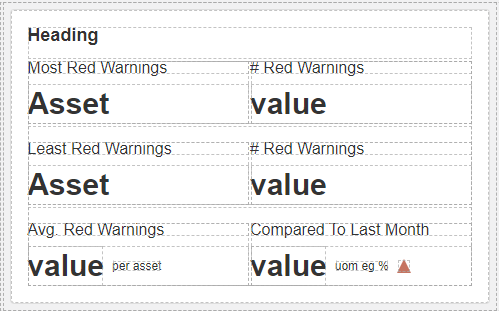
This widget comprises six (6) title-value components along with a heading. These title-value components serve as informative building blocks, offering quick access to key metrics. You also have the flexibility to include extra rows as per your preferences, should the need arise.
To optimize the available space, this widget features a single primary heading without any additional subheadings. In the comparison section, this widget provides up and down arrows that serve as indicators.
These arrows are highly configurable within the block properties, offering the flexibility to either maintain a consistent, static up-and-down appearance or morph into various other shapes to suit specific visual preferences and requirements that can typically driven from a data source.
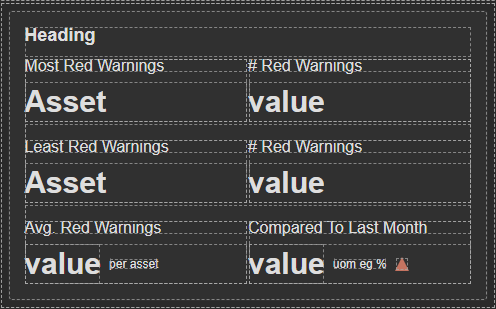
The widget is configured using:
| Block | Description |
|---|---|
| Indicator | To visually indicate the active state of the assets |
| Text | To display the live data |
| Box | A Box is a simple block that allows you to add data or other elements inside it |
To configure and use the data source section, select the box named Data Source and configure its data source under Block Properties.
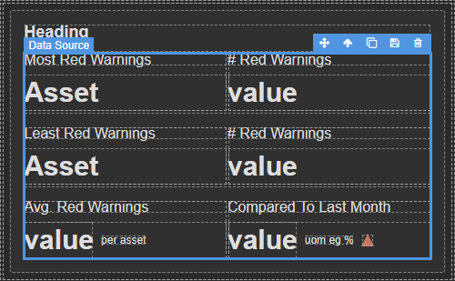
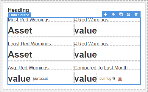
Make sure to change the fields within the box to get their values from the data source vs static.