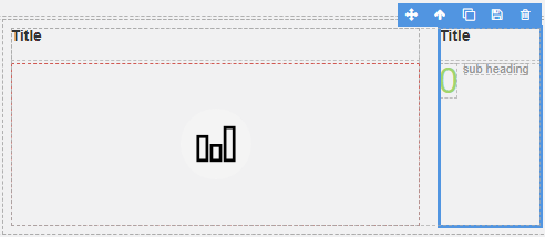
App Designer Widget
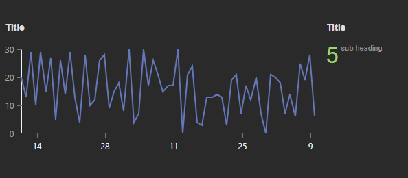
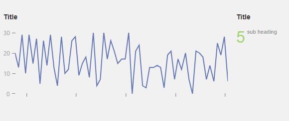
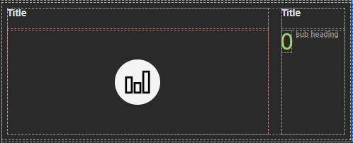
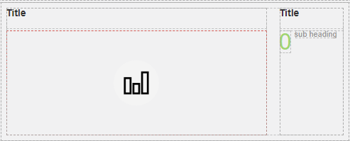
This widget is structured with a title and a graphical chart positioned on the left side, while on the right side, there is another title paired with a corresponding numerical value.
The most effective utilization of this widget comes into play when you have a need to conduct comparisons between diverse datasets or when you are keen on monitoring shifts and fluctuations in data patterns over a designated time frame.
The widget is configured using:
| Block | Description |
|---|---|
| Chart | To visually represent data using symbols, lines, or graphs. |
| Text | To display the live data |
| Box | A Box is a simple block that allows you to add data or other elements inside it |
To configure this widget select the Chart, you have several configuration options at your disposal.
Start by selecting the chart element itself, and then access the Block Properties menu to link a data source to the chart.
Additionally, you can fine-tune the appearance and behavior of the chart by configuring the X and Y axes. Tailor them to correspond to the specific data types you’re working with, and if desired, adjust the color schemes to align with your personal preferences.
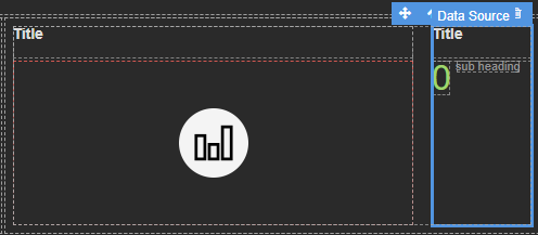
Make sure to change the fields within the box to get their values from the data source vs static.