App Designer Widget
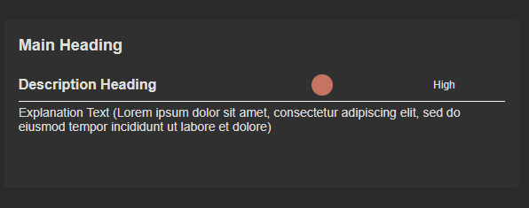
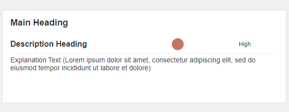
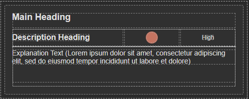
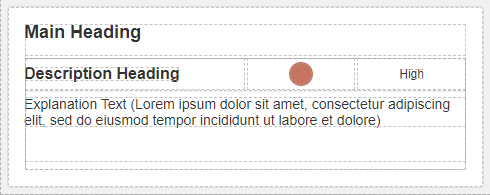
This widget includes a main title, a subheading, an indicator, and more detailed content below. It’s designed to present information clearly and in an organized way.
The main title summarizes the main idea, the subheading adds extra context, the indicator shows status, and the detailed content provides more information. These parts work together to make the widget effective for different types of content.
The widget is configured using:
| Block | Description |
|---|---|
| Indicator | To visually indicate the active state of the assets |
| Text | To display the live data |
| Box | A Box is a simple block that allows you to add data or other elements inside it |
To configure and use the total section, select the box named Data Source and configure its data source under Block Properties.
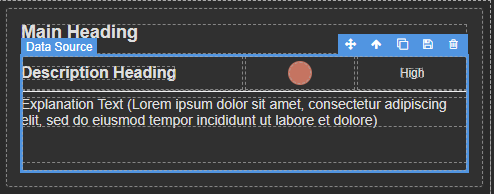
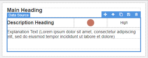
Make sure to change the fields within the box to get their values from the data source vs static.
