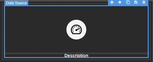
App Designer Widget
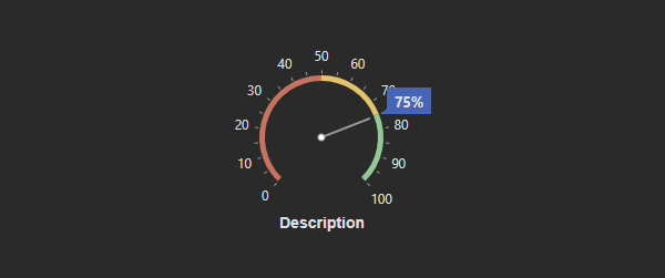
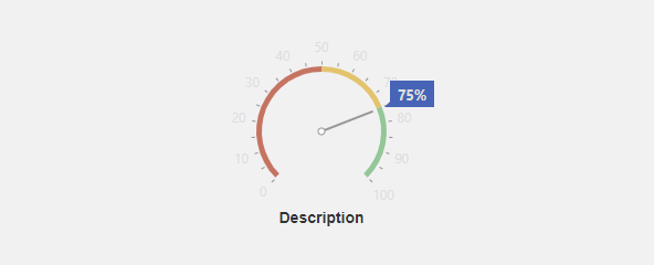
This widget comprises two primary components: the description and the circular gauge.
The “description” provides textual information or context, typically explaining the data or the purpose of the gauge.
The circular gauge serves as a visual representation of data or a measurement. It is a circular graphical element that can display information in a dynamic and easily interpretable manner, such as a progress indicator, a speedometer, or any other data visualization that can be represented in a circular format.
The widget is configured using:
| Block | Description |
|---|---|
| Circular Gauge | To visually display a linear scale or gauge |
| Text | To display the live data |
| Box | A Box is a simple block that allows you to add data or other elements inside it |
To configure and use the total section, select the box named Data Source and configure its data source under Block Properties. Within the same property section, you can also configure the circular gauge’s behavior, value, range, and appearance to suit your specific needs.
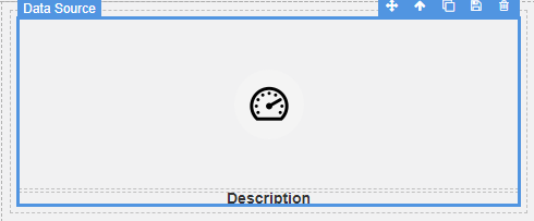
Make sure to change the fields within the box to get their values from the data source vs static.