
App Designer Widget
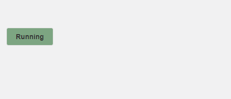
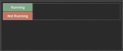
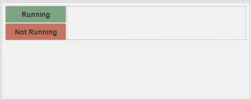
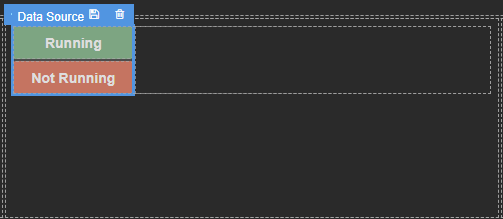
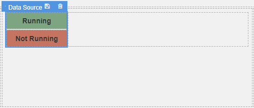
This widget offers two distinct states: “Running” and “Not Running,” serving as valuable indicators for the data or functionality integrated within the widget.
Furthermore, the elements within this widget are highly configurable, allowing you to tailor them precisely to your requirements.
The widget is configured using:
| Block | Description |
|---|---|
| Text | To display the live data |
| Box | A Box is a simple block that allows you to add data or other elements inside it |
To configure and use the total section, select the box named Data Source and configure its data source under Block Properties. This widget utilizes the data source to determine which visual indicators to display. You can choose whether to display the “Not Running” or the “Running” indicator by manipulating the visible flag under Block Properties.
You have the flexibility to decide whether to use a parameter, the data source itself, or even a dynamic expression to determine the visibility of these indicators.
Make sure to change the fields within the box to get their values from the data source vs static.