App Designer Widget
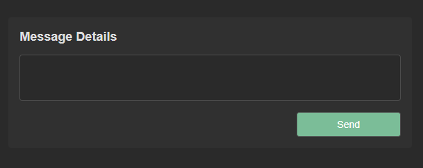
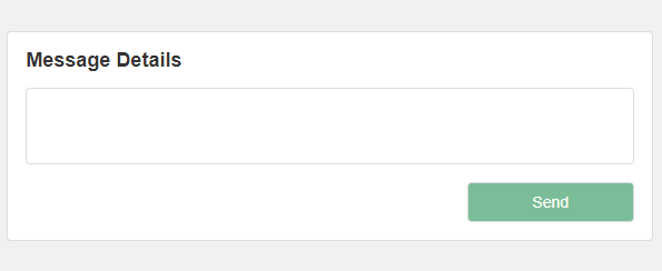
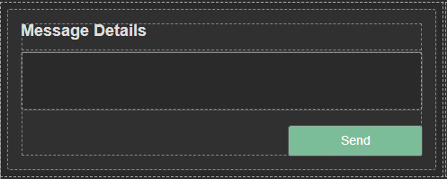
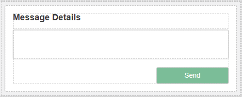
This widget incorporates a versatile text input field, providing users with the option to either manually enter text or load existing data into it. In addition to the text input field, the widget features a “Send” button, offering extensive configuration options for both its action and behavior.
The widget is configured using:
| Block | Description |
|---|---|
| Button | To trigger an event |
| Text | To display the live data |
| Box | A Box is a simple block that allows you to add data or other elements inside it |
To configure and use the total section, select the box named Data Source and configure its data source under Block Properties.
Additionally, you have the flexibility to tailor the behavior and action of the button to your preferences. Configure it to perform specific actions that align with your intended functionality.
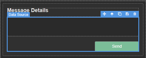
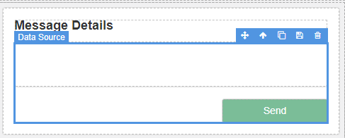
Make sure to change the fields within the box to get their values from the data source vs static.


